Please note some of the links in this post are affiliate links. This means if you click on the link and purchase the item, I will receive a small commission at no extra cost to you.
One of the cool things you can do with the Astra theme and the Astra Pro plugin is make your blog page look awesome with just a few clicks!
Install and Settings
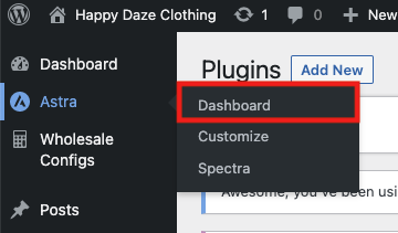
First of all you need to install the Astra theme and the Astra Pro plugin. Once done, you’ll have a new Astra menu item in the WordPress dashboard. Go to Admin > Astra > Dashboard to see all the pro options that are available (there are a lot!):
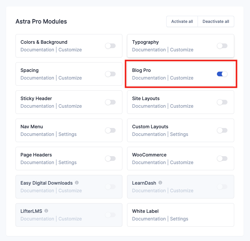
The one we are concerned with today is the Blog module. Scroll down to the Astra Pro Modules section and turn it on by clicking on the switch:
Now when I go to the customiser I’ll have a whole heap of extra options to style the blog page.

Customising the Blog Page
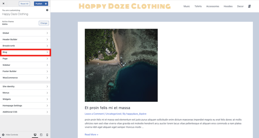
I’ve made some dummy blog posts with the Generate Dummy Posts plugin. Then I’ve gone to the blog page on the front end and clicked customise in the admin bar to open the customiser:
Out of the box my blog page looks like this:
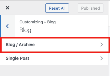
It’s looking pretty basic and unstyled, but that’s easily fixed. Click on Blog in the left hand menu to get to the options for the blog page, then click on the resulting “Blog/Archive” option to get to the full set of features:
Blog Page Options
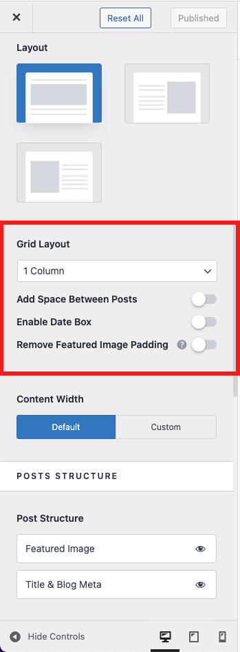
One of the great additional options that Astra Pro provides is being able to set the number of columns your blog page has. Scroll down the options until you get to the “Grid Layout” section:
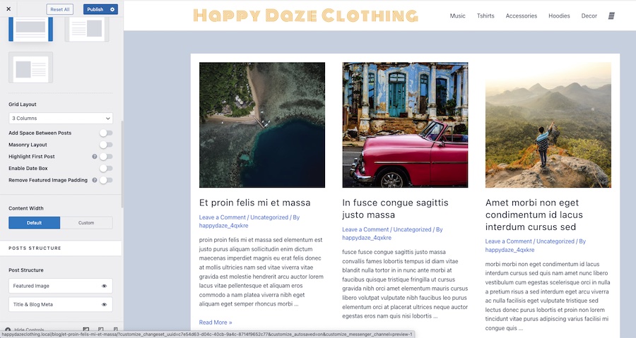
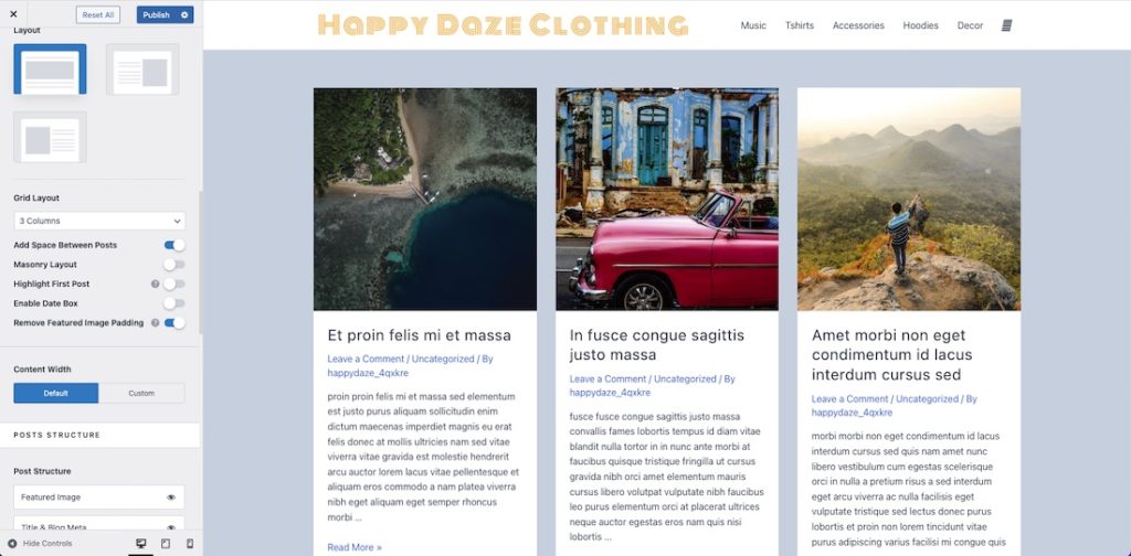
I’m going to set mine to 3 columns. The page is looking much better already:
Columns Give you Extra Options
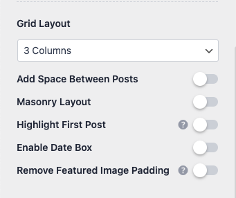
One of the things you’ll also notice is that choosing more than 1 column in the columns dropdown gives you a few extra options:
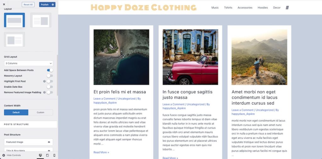
If I turn on “Add Space Between Posts” I get a boxed layout on the columns:
I can also use “Remove Featured Image Padding” to make the featured image the width of the column itself while leaving the padding on the text of the post:
I definitely prefer it with the padding, so will put that back!

Masonry
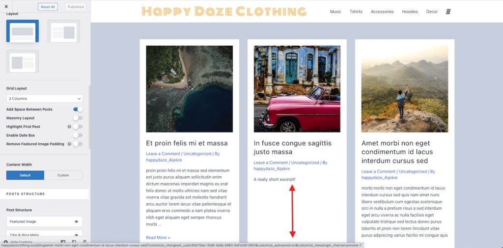
This looks pretty good and one of the reasons for that is that all my posts are showing excerpts of the same length. If I go in and make a couple of them have really short excerpts the layout is not as aligned:
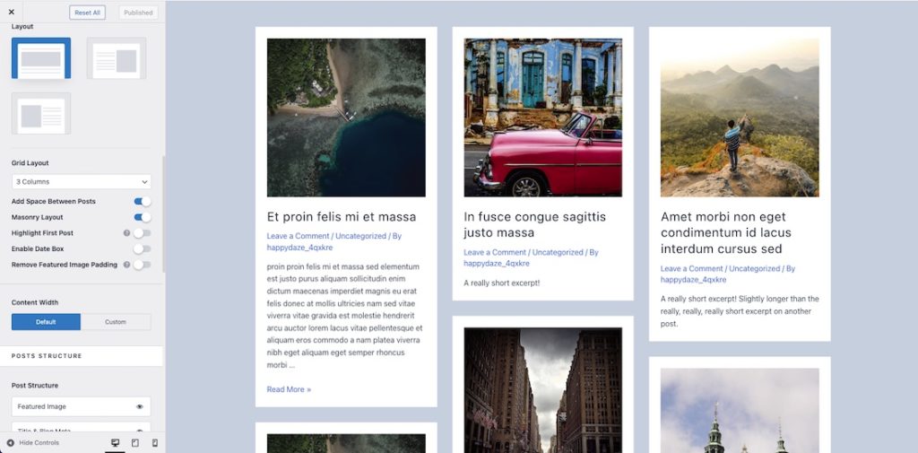
This is a good opportunity to make better use of the space with the masonry layout (switch on “Masonry Layout” for this):
Now each post takes up only the space it needs, and masonry looks really cool too!
Display Read More as Button
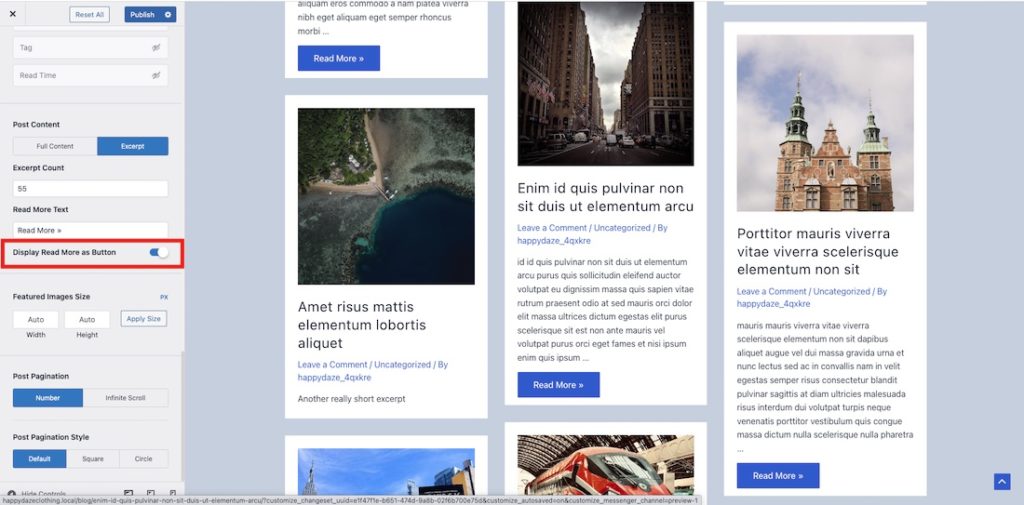
Another nice thing to do is to change the Read More link into a button:
Takeaway
There are other features in the blog customiser that you can explore, but as you can see, Astra Pro makes it really easy to style and layout your blog page nicely!

The featured image for this post is by Vincentiu Solomon on Unsplash

